Inspiration

The Velluvial Matrix is the commencement speech Atul Gawande gave Stanford’s School of Medicine.

Half a century ago, medicine was neither costly nor effective. Since then, however, science has combatted our ignorance. It has enumerated and identified, according to the international disease-classification system, more than 13,600 diagnoses—13,600 different ways our bodies can fail. And for each one we’ve discovered beneficial remedies—remedies that can reduce suffering, extend lives, and sometimes stop a disease altogether. But those remedies now include more than six thousand drugs and four thousand medical and surgical procedures. Our job in medicine is to make sure that all of this capability is deployed, town by town, in the right way at the right time, without harm or waste of resources, for every person alive. And we’re struggling. There is no industry in the world with 13,600 different service lines to deliver.

It’s worth a read.

***

Also worth the read, but in a totally different way: some folks write one of the most interesting Facebook updates I’ve ever seen.

***

This article from Donna Spencer got me out of a major funk last week.

The more design work I do the more I realise that there is no such thing – there is no right answer to a design problem. […] There are only bad, good and better answers for the current situation. Each of the potential solutions sits within a particular context.

 

Link dump. Twitter says I have over 1100 favorites, but I can’t find them all, so I’m moving stuff here instead.

Little Wheel
Little Wheel

OK, that’s enough for tonight.

More Health Care info….

Wow, this health care stuff is complicated. Let’s check out some charts. Informational graphics by our politicians are designed to make it all clearer, right?

There’s an article pointing to some charts here….Ezra Klein – When Health-Care Reform Stops Being Polite and Starts Making Charts and over here…. Political Chart Wars: Health-Care Reform Obfuscated by Infographics.

They include this doozy:

WTF?

(yes, I hotlinked the images in this post, yes I’m against that, yes, I’ll fix that later.)

Hmm, charts by idiot politicians, maybe not a good idea…

I also have to admit, I was amused by the Democratic comeback:
??

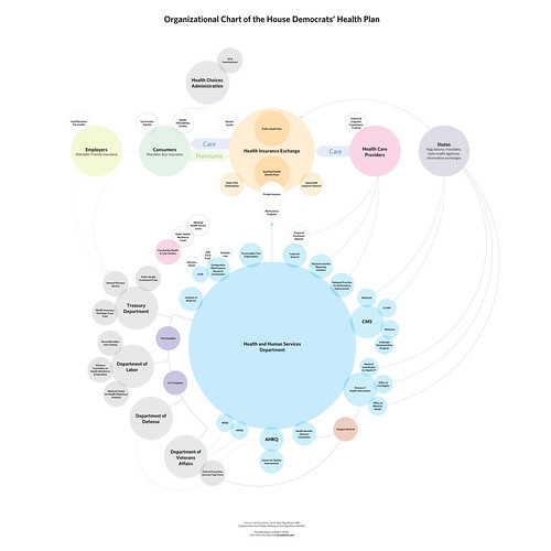
So now that everyone’s had fun trying to make readers blind by putting bright colors on a dark grey bakground, maybe we should let an actual information/graphic designer give it a shot. This one’s called do not fuck with graphic designers.

Hey, something usable!

The letter below the image pretty much says how anyone in charge of presenting accurate and understandable information feels about that monster you see above. You can see the full pdf here and, OMG, it actually makes a bit of sense.

Now, if only any of them were indicative of a simple health care system….

With thanks to Joe Lanman on this thread of the IXDA discussion board.

Health care – a round-up

This is mostly a link dump so I can come back and find these articles again if I need them.

And then there’s one of the most useful sites I’ve found on health care and politics so far, Politifact. These folks are taking those things you’re hearing on TV or reading in the paper and fact-checking them. Then, they post the results online with a grade ranging from “true” to “mostly true” to “half true” to “false” to “pants on fire”. They also occasionally check to see if a politician accused of flip-flopping on an issue did.

It’s a particularly good place to find information on who said what and whether it was true, because most of the news I learn about health care right now is third-hand (so-and-so on the radio/tv/whatever that congress said….) and that means that it’s getting blown out of proportion…. and when it’s a lie to begin with, well, it’s no wonder everyone is afraid and confused.

Probably more on this later, but for now I’m just trying to learn everything possible to find out what the hell’s really going on.