Wow, this health care stuff is complicated. Let’s check out some charts. Informational graphics by our politicians are designed to make it all clearer, right?
There’s an article pointing to some charts here….Ezra Klein – When Health-Care Reform Stops Being Polite and Starts Making Charts and over here…. Political Chart Wars: Health-Care Reform Obfuscated by Infographics.
They include this doozy:

(yes, I hotlinked the images in this post, yes I’m against that, yes, I’ll fix that later.)
Hmm, charts by idiot politicians, maybe not a good idea…
I also have to admit, I was amused by the Democratic comeback:

So now that everyone’s had fun trying to make readers blind by putting bright colors on a dark grey bakground, maybe we should let an actual information/graphic designer give it a shot. This one’s called do not fuck with graphic designers.
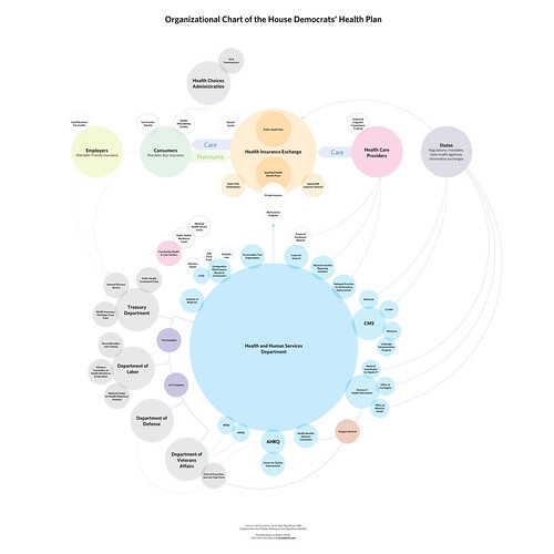
The letter below the image pretty much says how anyone in charge of presenting accurate and understandable information feels about that monster you see above. You can see the full pdf here and, OMG, it actually makes a bit of sense.
Now, if only any of them were indicative of a simple health care system….
With thanks to Joe Lanman on this thread of the IXDA discussion board.